Line charts are the default visualization for anything that changes over time. Revenue by month, website traffic by week, customer churn by quarter: if the x-axis is a date and the y-axis is a metric, you’re probably looking at a line chart. The reason is ergonomic: the human eye follows a line naturally from left to right, interpreting slope as change and flatness as stability.
But while line charts are simple to create, they’re surprisingly easy to get wrong. This guide covers the principles that separate a clear line chart from a misleading one.
What Line Charts Communicate
A line chart answers three questions: Is the metric going up, going down, or staying flat? How fast is it changing? And are there any notable anomalies (spikes, drops, or seasonal patterns)?
The line itself is the analysis. The slope between any two points communicates the rate of change. A steep upward slope means fast growth; a gentle slope means slow growth; a flat line means stability. The reader doesn’t need to compare bar heights or count pixels. The shape of the line tells the story.
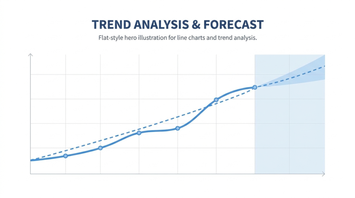
This is why line charts are almost always better than bar charts for time-series data. A bar chart with 52 weekly bars is a wall of rectangles. A line chart with 52 weekly points is a single continuous shape that the eye can parse in seconds.
How Many Data Points Is Enough
Two data points make a slope, not a trend. Five data points let the reader see a direction. Twelve data points let them see seasonality. Fifty-two data points (a year of weekly data) let them see both the trend and the noise around it.
The sweet spot for most business line charts is 12-24 data points. Monthly data for one or two years gives enough signal to see trends and seasonality without drowning the reader in noise.
If your data has hundreds of points (daily data over multiple years), consider aggregating to weekly or monthly before plotting. Alternatively, keep the raw data as a thin, light-colored line and overlay a moving average as a thicker, darker line. This layered approach shows both the detail and the trend.
Adding Trendlines and Moving Averages
Raw data is noisy. A trendline helps the reader see through the noise to the underlying direction.
A linear trendline is the simplest: it draws a single straight line that best fits the data points. This works when the underlying trend is roughly constant (steady growth, steady decline). The slope of the trendline is the summary statistic the reader takes away.
A moving average is better for data with seasonal patterns or irregular spikes. A 4-period moving average smooths month-to-month noise while preserving quarterly shifts. A 12-period moving average on monthly data smooths seasonal effects entirely, leaving only the long-term trend.
The key is to match the smoothing window to the noise pattern. If your data has weekly cycles, use a 7-day moving average. If it has monthly cycles, use a 3-month or 12-month window. If you don’t know the noise pattern, start with a 4-period window and adjust.
Dual-Axis Line Charts: Proceed With Caution
Dual-axis charts plot two metrics with different scales on the same chart, using the left axis for one and the right axis for the other. They’re common in business reporting (revenue on the left, profit margin on the right) but frequently misused.
The danger is that the reader assumes the two lines are on the same scale, which leads to misinterpretation. If you stretch one axis to make the lines cross at a specific point, you can make any two metrics appear correlated.
If you use a dual-axis chart, label both axes clearly with units and make the two lines visually distinct (different colors and different line styles). Better yet, consider using two separate charts stacked vertically with aligned x-axes. This avoids the scale confusion entirely and is the recommendation of most data visualization practitioners.
Tools for Building Line Charts
Excel and Google Sheets handle line charts well for small datasets. Select your data, insert a line chart, and customize from there. For a line chart generator with better defaults and faster styling, ChartGen AI takes a data paste and a natural-language description and returns a polished chart in seconds. This is particularly useful when you need several line charts with consistent styling for a single report.
For programmatic workflows that run on a schedule, Python’s matplotlib or R’s ggplot2 are the standard choices. But for one-off charts in a business context, the overhead of writing code is rarely justified.
Conclusion
Line charts are the clearest way to show how a metric changes over time. Keep the axis at zero (or explain why you truncated it), add a trendline when the raw data is noisy, be cautious with dual axes, and choose the right aggregation level for your audience. A well-made line chart communicates more in three seconds than a paragraph of text ever could.